Blog 2
Work In Progress
Storyboards
Throughout the progression of my storyboarding, I have undergone what I believe to be the first four stages of the 7-step design process outlined in Gavin Ambrose and Paul Harris’s Design Thinking (2009). Those Being Define, Research, Ideate and Prototype, In which I have established a brief, examined aesthetic inspiration, pursued various designs before finally completing my storyboard, as of my 1-1 consultation it is clear that I need to refine the amount of frames I wish to include, rather focusing on a smaller quantity of frames, leading to stage five, Select.
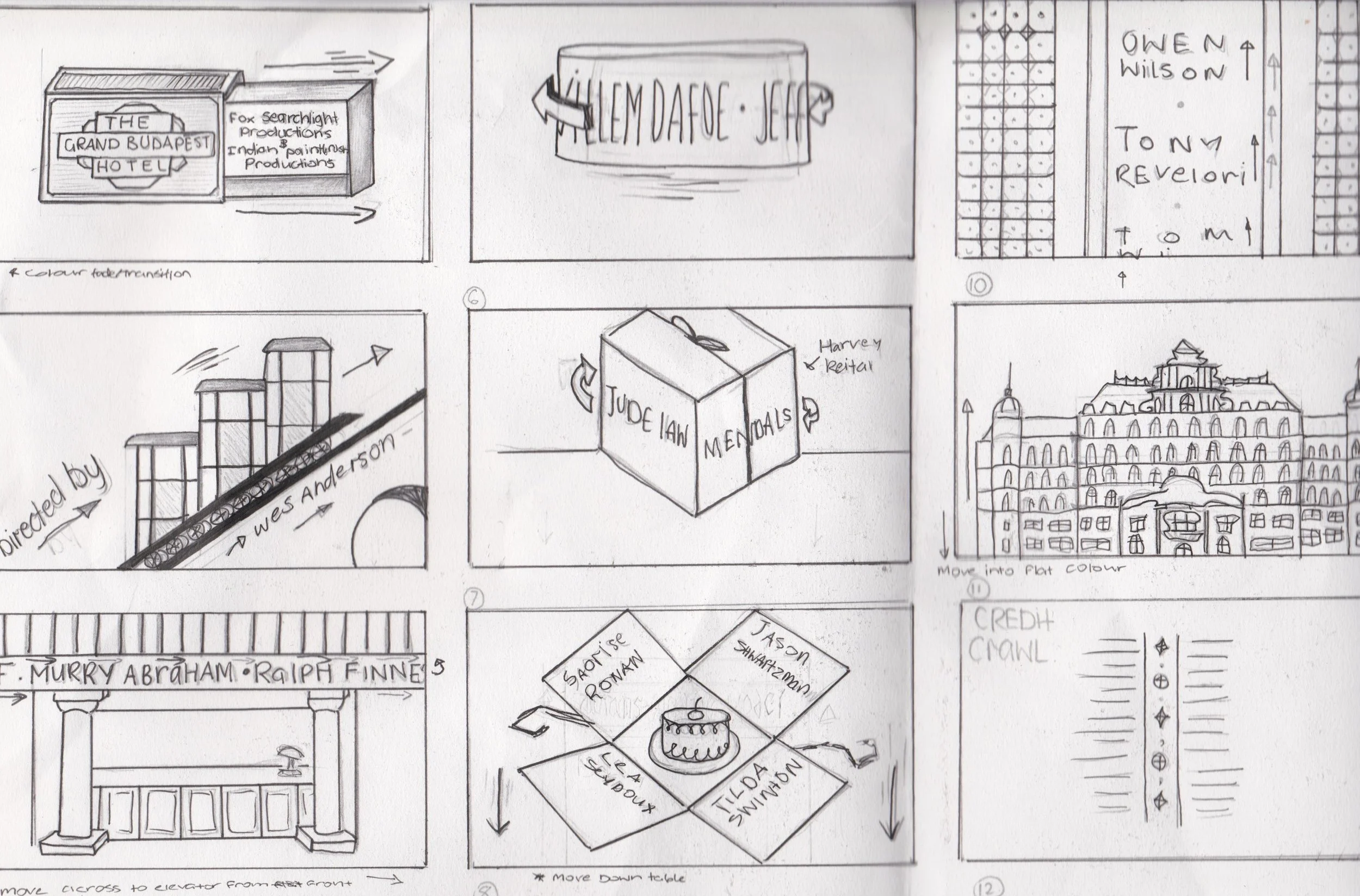
Story Board #1
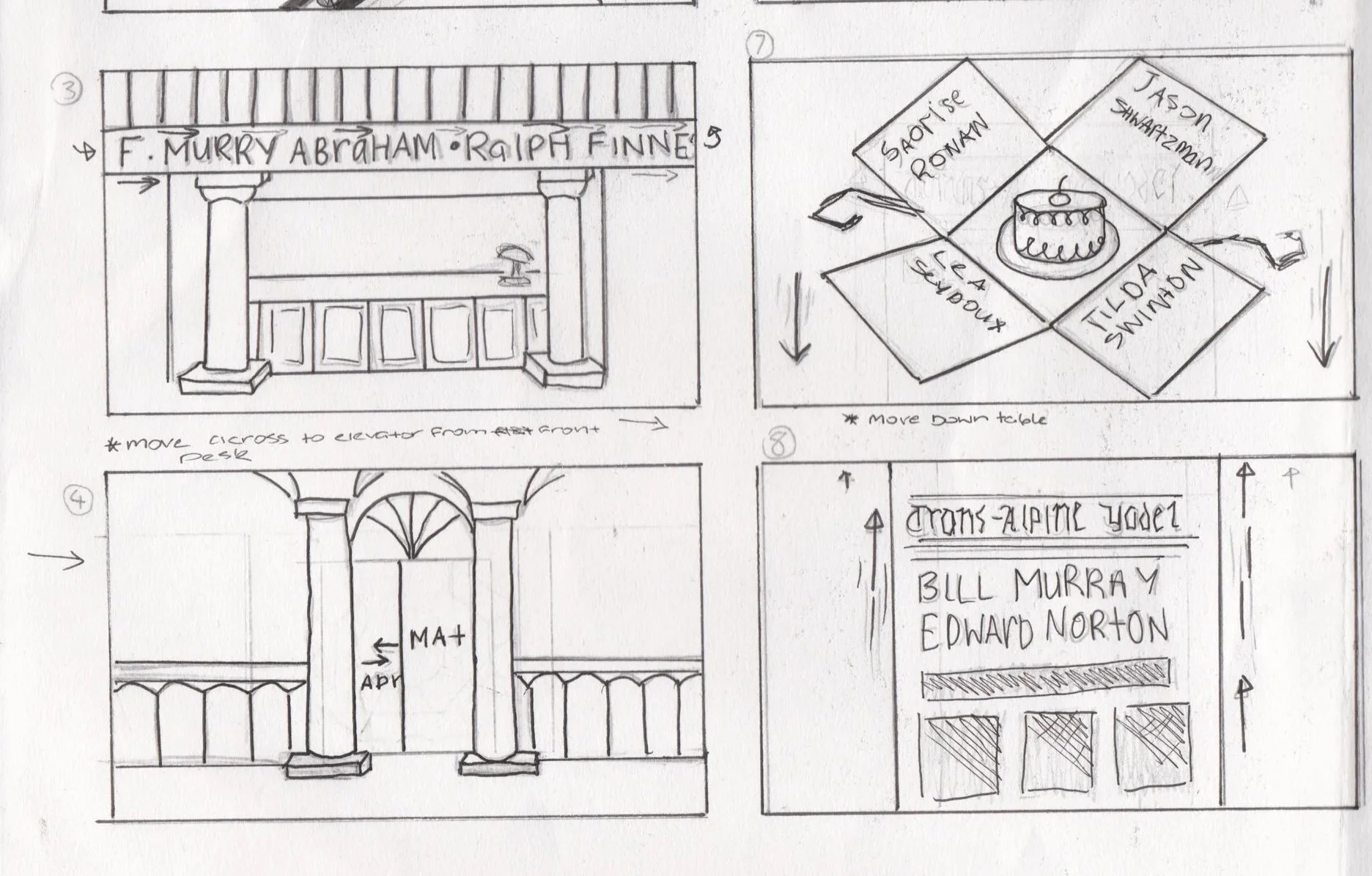
Story board #2
Within my storyboards, I have also indicated elements of motion, both object and camera as detailed in ‘Motion Graphic Design: Applied History and Aesthetics’ by Jon Krasner (2013). I am wanting to incorporate both of these elements as to not have the product appear too monotonous. However I have found that there are some motions that I am choosing to exclude that I originally detailed in my storyboard, that including the Mendls box unfolding, I have done so with the intention of not over-complicating my design and focusing on making stronger the more achievable elements of motion.
Graphic Design fundamentals
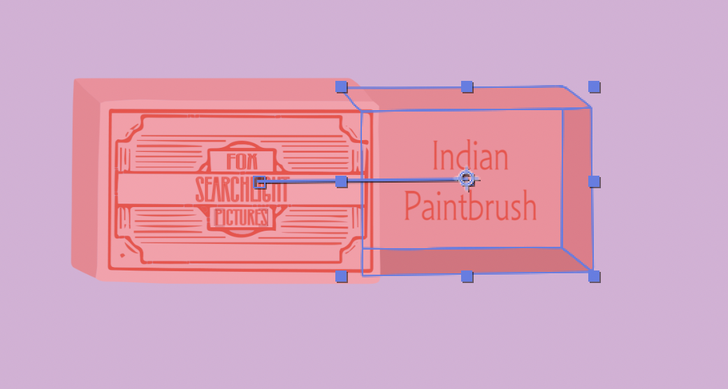
In my compositions I am exploring space relationships and colour theory. Working predominantly with a pastel colour palette as seen throughout The Grand Budapest Hotel, for which I have based task 1 on. I found that working with contrast within this pallet to provide a learning curve however when using the pastels together, the best way to contrast them with one another was to pair colours that displayed the most difference when in grey scale. I have developed many of my original frames as seen in the story board into illustrations using Procreate, for which I will then transfer to illustrator.
In regard to the space relationships I chose to employ, I am focused primarily on one salient feature per frame, this I found to appear more aesthetically aligned to the Wes Anderson’s Grand Budapest Hotel (2014) as well as also allowing me to focus more easily on movement as I begin working in adobe After effects.
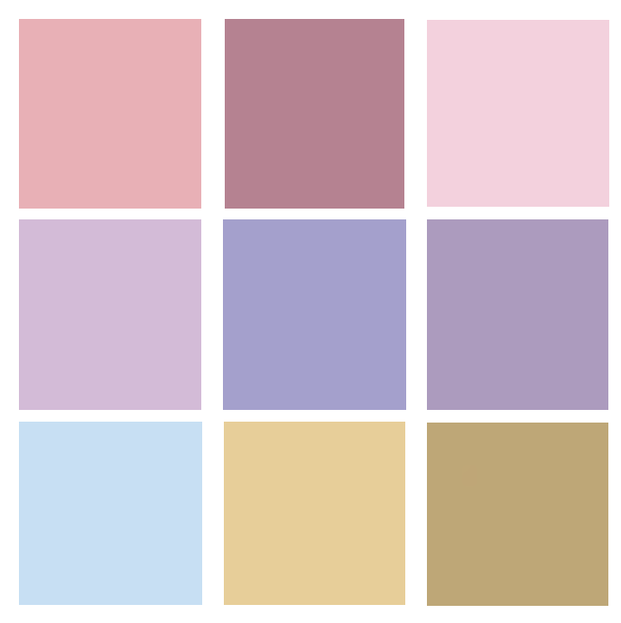
Colour Pallet

ProCreate Illustration
Working with After Effects
In beginning the process of working in Adobe After Effects I have moved my Procreate illustrations to SVG files, from here I have been making some minor adjustments in illustrator in regards to the layers and have begun transferring them into my After Effects composition, This process being reasonably simple to work with. I have completed my first frame, that of the matchbox opening by changing the positioning of the inside box and parenting the text inside of it to the box itself, this being my first trial of object motion.
First After effects attempt
References
Krasner, JK 2013, Motion Graphic Design: Applied History and Aesthetics, Focal Press, Burlington, Massachusetts.
Ambrose, GA, Harris, PH 2009, Design Thinking, AVA Publishing, Switzerland