Blog 5
In regard to my design process alongside visual research, that of which has in large part stemmed from the earlier mentioned themovingposter.com, I have looked and found many posters on Pinterest for which have proved incredibly useful in understanding not only my intended design but have in part aided in how to best approach the making process. As attached below many of the designs that I have gravitated to and later used as reference have a strong focus on busy graphics, that of which may appear simple in form (i.e. lots of colourful squares) however in this simplicity offer a strong focus on composition as it relates to basic shapes and colours. As discussed in Motion Graphic Design by Jon Krasner this strong focus of shape lends itself to Experimental animation that was strongly influenced by cubist painters who “began expressing space in geometric terms.” (Krasner, 2013, P.23)


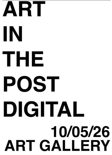
In regard to technical development, I have been first working with the format of my type, knowing that I would be using Helvetica bold as the chosen font, below I have attached a few examples of the formatting of the main text. I have ended up deciding however that the font will be neither right or left justified but centred, and that this will remain the same across all three posters. Regarding text as well I have also been working with colouring the text, however whilst I like this aesthetically, once the design is in motion it appears far to illegible.


*Experiments with type layout
*Experiments with colourful type

*Finalised type layout
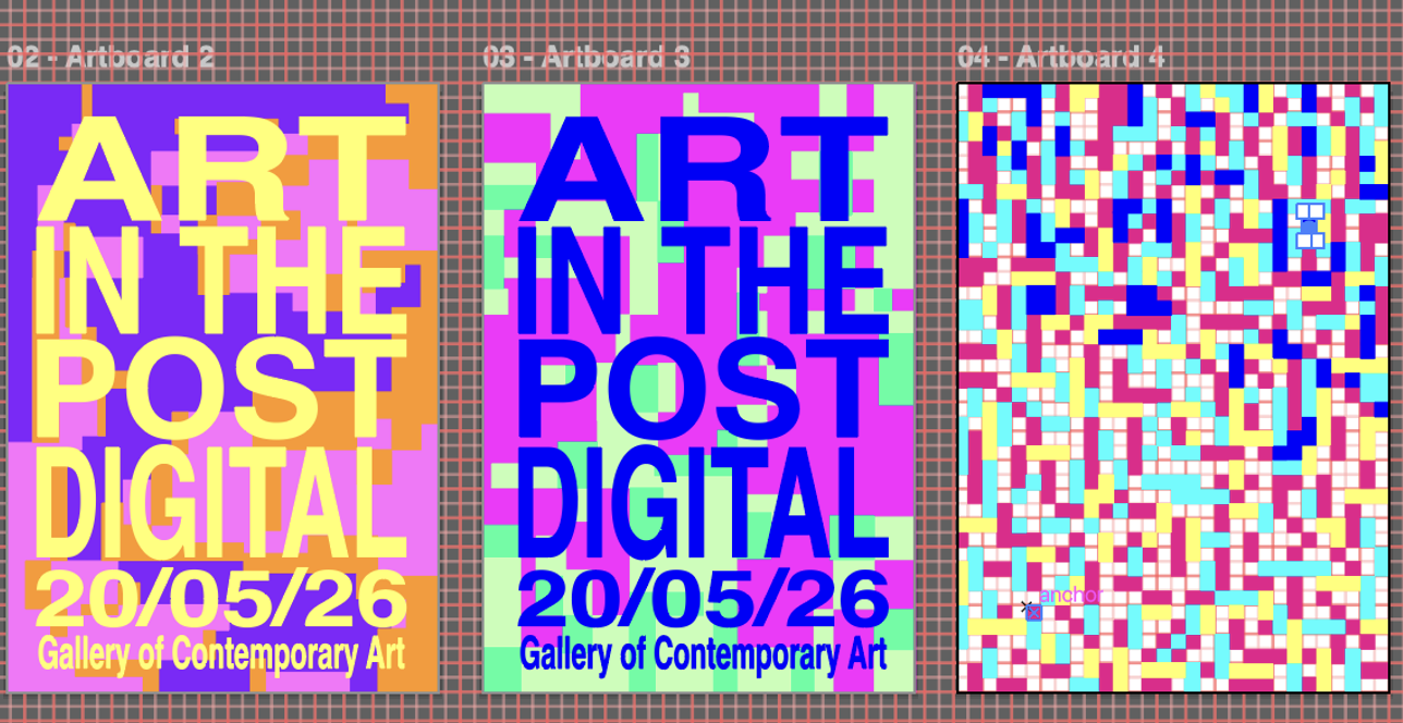
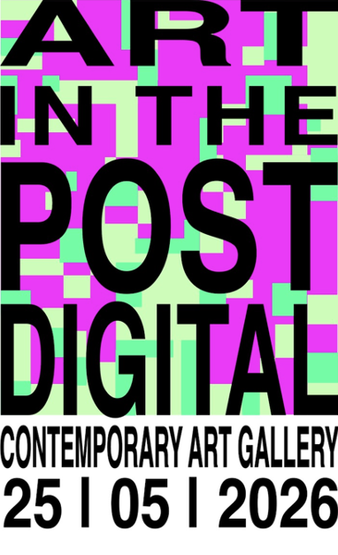
In formatting the pixel-like backdrops for these posters, I have decided that the busiest of the three would be the main poster. I have created these graphics in two ways, both in illustrator however for the busiest design I have used a strict grid, for the other two I have maintained a grid however have allowed the design to not so strictly conform to a pattern, as seen below.


The earliest of the significant changes I have had to make in project two took their shape in regards to colour. I found that my initial colours proposed, those of which I have shown in my story board didn’t translate in terms of aesthetics and legibility when it came to digitally adapting my design. Working initially from illustrator I found that I had to resolve all font design decisions within after effects as the effects in which I was wanting to apply to my text were not able to be done to Illustrator files, this proved slightly challenging as formatting the font to the size and scale that I had designed my background layers proved tedious. In new technical skills that altered the development of my project, I referred to the video
How To Make Glitch Effect in After Effects by Learn In Five on YouTube in which helped in understanding how to apply a glitch design to my font, in which a glitched video is used as an undelay, adding type atop the video, adding an adjustment layer to which a displacement map is applied, and attaching this layer to the glitched video stock footage.
References
Krasner, JK 2013, Motion Graphic Design: Applied History and Aesthetics, Focal Press, Burlington, Massachusetts.
Newman, AN 2017, How To Make Glitch Effect in After Effects | Easy Tutorial, Video, Learnin5, viewed 30th May 2026, YouTube. https://www.youtube.com/watch?v=OfHN2GSkAP8
Image 1 – Unknown, 2026, Image, Pinterest viewed 14th May 2026, https://au.pinterest.com/pin/849421179763571435/
Image 2 – Antidesign, NA No Date, Since when has it become not cool to try?, Image, Pinterest, viewed 14th May 2026, https://au.pinterest.com/pin/849421179763571555/