Blog 6
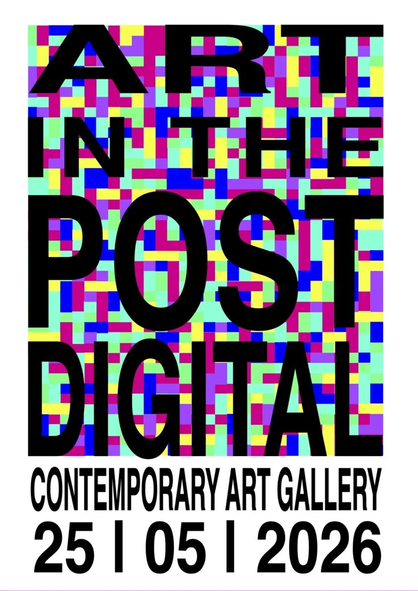
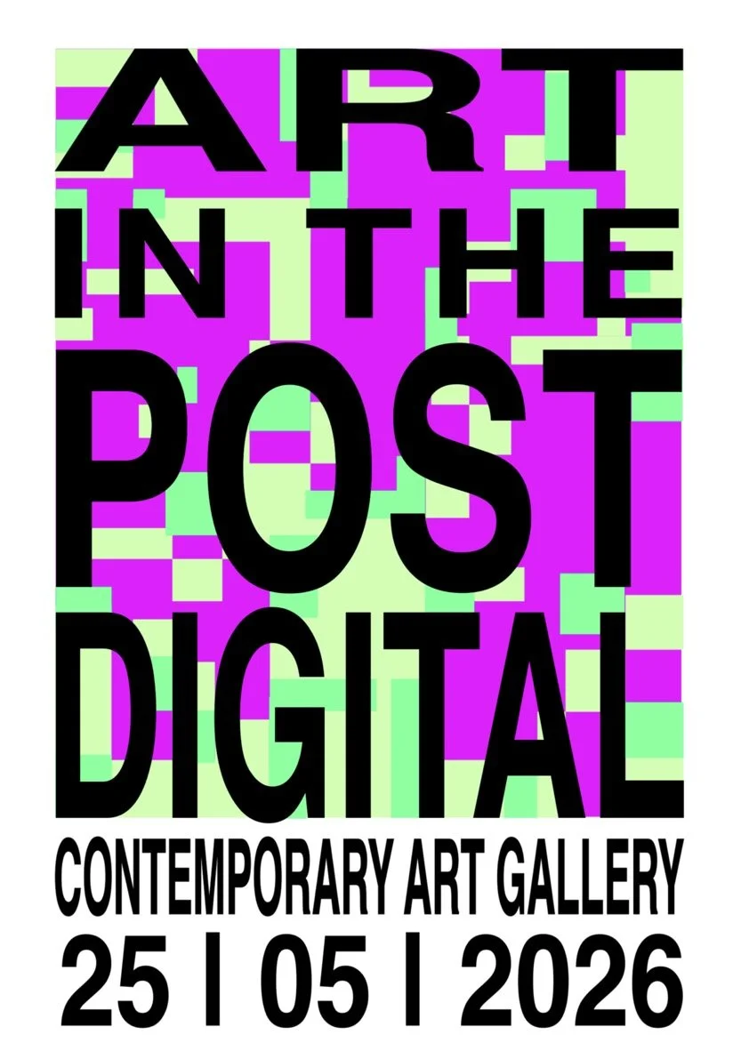
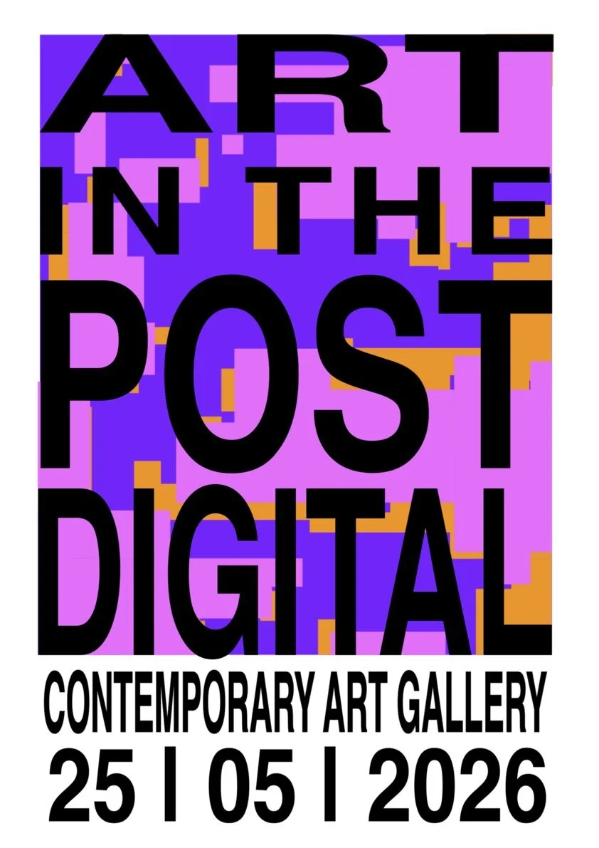
In looking at the outcomes of my second project, in terms of technical achievement I feel as though I was able to produce a strong series of posters. The elements were rather simple however in formatting the design predominantly within Adobe After Effects rather than Illustrator there proved a more difficult level in being able to gauge if the design itself was in fact aligned and that all the elements were properly situated. In regard to motion fundamentals, I chose to expand on the basic principles I encountered during our first project, those of which included manipulating positioning and scale, whilst incorporating these I also chose to focus very heavily on the temporal component of the work as the design itself wasn’t overly complicated. In focusing on how these elements behaved in regard to time, that being that all the components moved at a fast pace to give the illusion of a more complex and engaging design to work best within the AR format. I also chose to expand on kinetic typography as the primary motion across the three posters. Whilst the backgrounds are all moving the type is the core focus, done through the glitching design however when the posters are not in movement through AR the core aesthetic and purpose of the posters is still easily understandable, as discussed by Jon Krasner in Motion Graphic Design “Choosing the appropriate graphic style is critical to supporting your concept, message, or mood” (Krasner, 2013, P.172), this sentiment I believe key in having the posters appearing coherent with one another when not in motion. Regarding the aesthetic outcomes of the work and the final design, the series of posters are recognizable in their goals, that of which communicates to viewers not only the exhibition and its most basic information, but the theme, in which is explored through the design. I am overall very happy with the outcome of my designs in which I feel as though they met the standard I set for myself and were able to communicate the core focus of the proposed exhibition, however I feel as though had I stuck to a specific grid pattern for the background, rather than opting for the three varied background designs the series may have looked better refined.
In looking towards the Critical moments and design decisions in the making of this project I found that they related to using Adobe After Effects as the primary illustrative tool, adapting previously learned techniques to better fit my current goals and furthermore experimenting with kinetic typography and the associated techniques. Using After Effects as the main design tool for this project wasn’t my intention as I feel far more comfortable using illustrator of Procreate however in working with AR I found working in After Effects to be the most effective way in which I could design whilst keeping motion in mind. How the illustrations behaved rather than solely their aesthetic purposes proved to be extremely important in working with AR. Adapting the techniques I had employed during project one was also critical in best resolving this work, moving outside how I had previously used positioning and pacing, that of which I had previously done to try appear seamless, I instead chose to use these tools in the most chaotic way I could, the background design does not follow a pattern in relation to movement but has been heavily aided by temporal design elements to make the movement seem cohesive in relation to the theme. Furthermore, exploring the use of kinetic typography as the primary motion within this project proved to be one if not the most important design decisions, not only did it make the posters seem better connected in their aesthetic intentions, but it also allowed me to explore an entirely new pathway of design that I had previously not worked with.
In relation to how I may utilise or adapt the knowledge that I have gained working on project two I believe that I have created a myriad of pathways within my personal and professional artistic practice in which I could use these tools. Being able to use motion design in conjunction with promotional material has been an incredibly beneficial tool, not only can I further envelop this into my greater artistic practice in presenting my own works, but in adapting my works into motion design pieces that are not only promotional but with the incorporation of techniques such as kinetic typography and temporal considerations I am able to expand my works into various channels of artmaking. I am able to further expand my work to its promotional material, whether this is done through posters, branding materials or short form video content, all of which I believe would be great experiments in continuing to adapt these skills.
Final Posters

Posters In Motion
EyeJack QR codes

EyeJack links

References
Krasner, JK 2013, Motion Graphic Design: Applied History and Aesthetics, Focal Press, Burlington, Massachusetts.